Thursday, December 11, 2014

Hyperspectral Remote Sensing

- Introduction -

The last topic of the semester is an introduction to hyperspectral remotely sensed imagery. Over the course of the semester, multispectral imagery (ex. Landsat TM) has been used for different types of analysis. Hyperspectral imagery (ex. AVIRIS) differs from multispectral in the number of bands and range of the electromagnetic spectrum covered. Typically, multispectral imagery will have under 15 or so bands that cover broader ranges of the electromagnetic spectrum in multiple spectral ranges (ex. VIS, NIR, SWIR, and MWIR). Hyperspectral imagery however, can have hundreds of bands that range in a single spectral channel, allowing for much more distinction in specific land surface features. In this lab, bad band removal, anomaly detection, and target detection will be explored.

- Methods -

Image 1: The largest viewer shows both the anomaly mask
and the original image with a swipe function for comparison.
Both anomaly detection and target detection were performed on AVIRIS imagery in Erdas Imagine 2010 with all bands and again with bad bands excluded, for comparison. Anomaly detection was performed by navigating to Raster > Hyperspectral > Anomaly Detection and following the steps of the Anomaly Detection Wizard. After the anomaly mask had been created it was opened in the Spectral Analysis Workstation and compared to the original image (Image 1). This first mask was created using all bands. The process was then repeated with bad bands excluded through an additional step in the Anomaly Detection Wizard.


In the Bad Band Specification window in the Anomaly Detection Wizard, Bad Band Selection tool (Image 2) was opened. In the Bad Band Selection tool, all 224 bands of the AVIRIS image could be cycled through and analyzed by their individual histograms and mean plot window. Bands with multimodal histograms and visible differences in the mean plot window signified bands with low signal-to-noise ratio and should not be included in analysis. These bands were then singled out and saved as a bad band list file that was then used in both anomaly detection and target detection later on.

Image 2: Tool used to select bad bands. Areas of red in the
mean plot window indicate selected bad bands.

Target Detection was performed by navigating to Raster > Hyperspectral > Target Detection and following the steps of the Target Detection Wizard. The first target detection used a custom derived Buddingtonite spectrum library file and used all 224 bands. The second target detection used the USGS Buddingtonite_NHB2301 spectrum library file and excluded the bad bands designated earlier. The resulting target masks were then compared (Image 3).


Image 3: The largest (main) viewer shows the target detection mask
and the original image for comparison.

- Discussion -

In both the anomaly detection and target detection, masked area increased after the bad bands were excluded. The size of the masked areas typically increased and new masked areas were created. This illustrates that using bands with low signal-to-noise ratio resulted in less accurate results. The results of the anomaly detection could be further improved by using only a subset of the image instead of the whole image. This is because the anomalies are distinguished based on an estimated background spectra of the area used. By using a smaller area, more anomalies could potentially be identified. The detection of the specific mineral Buddingtonite would not be possible with multispectral imagery and illustrates the advantages of hyperspectral data in collection of specific land cover types.

- Conclusion -

The selection of bad bands is typically not essential for analysis of multispectral imagery, but as this lab has demonstrated, is essential of hyperspectral imagery. Band bands in hyperspectral imagery can result from atmospheric effects or sensor malfunction. Band histograms can be used to identify the bad bands with low signal-to-noise ratio that should be excluded from analysis. Hyperspectral data is useful for examining specific wavelengths which help analysts determine land cover types and calculate band ratios with far more specificity.

- Sources -

Erdas Imagine, 2010. Modified Spectral Analysis Workstation Tour Guide.


Wednesday, December 10, 2014

Lidar Remote Sensing

- Introduction -

Lidar is an active remote sensing technology that uses the backscattered time differential of self generated laser pulses to accurately model the earth's surface. Lidar stands for light detection and ranging and typically uses NIR radiation around 1.64 micrometers to detect land surface features. Multiple products can be generated through use of Lidar data due to the volume and nature of the light that is produced by the system. For example, the light can penetrate vegetation cover resulting in multiple returns for the top of the tree canopy, branches, lower vegetation, and ground. These returns can be used to extract different information and create different surfaces. In this lab exercise, Lidar data will be visualized in 2D and 3D and multiple derivative products will be created.

- Methods -

Using ArcMap 10.2.2, a LAS dataset was created and Lidar data for the City of Eau Claire, WI was imported in. In the LAS Dataset Properties window, general information on the whole LAS dataset, information like point count, point spacing, and Z min and max for individual LAS files, statistics, XY coordinate system, and Z coordinate system can be viewed and modified. Using the LAS toolbar, the different returns can be viewed as points (Images 1 - 4) or as a triangulated irregular network (TIN) surfaces representing elevation (Image 5), slope (Image 6), or aspect (Image 7). Contours can also be created and visualized (Image 8). Depending on which return is used, digital surface models (DSM) or digital terrain models (DTM) can be created. Using first returns will generate a DSM that represents the surface of the landscape including surface features like trees and buildings. Using ground returns will generate a DTM that represents the actual elevation of the landscape without any surface features. With the LAS Dataset to Raster tool in ArcMap and using the proper returns, both a DSM and DTM were created for the City of Eau Claire. Hillshades were then created of both the DSM and DTM for visual comparison (Image 10). The last derivative product created was an intensity image (Image 11). Intensity is stored in the first returns and the resulting image can be used as ancillary data in image classification. This is because the light used by the Lidar system is within the NIR channel which can be used to parse out different land covers. Lighter areas in the intensity image are reflecting more NIR radiation, signifying bare ground and some urban features. Darker areas represent thick vegetation and the darkest areas are water.


Image 1: All returns symbolized by elevation


Image 2: First return symbolized by elevation


Image 3: Non ground return symbolized by elevation


Image 4: Last (ground) return symbolized by elevation


Image 5: TIN surface of all returns symbolized by elevation


Image 6: TIN surface of all returns symbolized by slope


Image 7: TIN surface of all returns symbolized by aspect


Image 8: Five foot contours


Image 9: 2D and 3D views of a bridge


- Results -

Image 10: Comparison of the hillshades for the DSM (left) and DTM (right) 


Image 11: Intensity image


- Discussion -

Lidar data can lead to exceedingly highly accurate representations of earths surface and can provide meaningful information on earth surface features. The quality of the Lidar data depends on the amount of points collected. This data had an average point spacing of about 1.5 feet. As seen in the images above, water features are sometimes not modeled very well. This is because of waters ability to absorb the NIR radiation coming from the Lidar system resulting in less points and a less accurate surface. If water features are of primary concern, the light produced by the Lidar system can be changed to a wavelength around 0.53 micrometers, within the blue/green channels. Not only can the intensity of the first return be used as ancillary data for image classification but also sections of elevation can be singled out and used as well. Using first and intermediate returns in vegetated areas can give measures of forest biomass. Road networks can be easily distinguished by using ground returns even when not visible in imagery due to vegetation. The list of applications that Lidar data can be used for goes on and on.

- Conclusion -

The applications of Lidar data are numerous and still being explored. This lab exercise was an introduction to using Lidar data that was already processed and ready for use. Pre-processing of Lidar data can be quite complicated, but once completed, the data is a valuable resource. Elevation, slope, aspect, DSM and DTM surfaces can be generated and by using different combinations of returns, a variety of biophysical, economic, and cultural information can be extracted.

- Sources -

Eau Claire County, 2013. Lidar point cloud and tile index.


Tuesday, December 2, 2014

Object-based Classification

- Introduction -

The last classification technique of the semester, object-based classification, is a fairly new method which attempts to succeed where per-pixel or sub-pixel classifiers fail. Pixel-based classifiers only account for spectral properties in an image when determining informational classes which often results in the salt and pepper effect and similar pixelated landscape patterns. By accounting for spatial properties, like distance, texture, and shape, an object-based classifier results in a more natural looking and often times more accurate classified image. Object-based classification segments an image into areas based on both spectral and spatial homogeneity criteria. An analyst can then classify specific objects and use them as training samples to classify the entire image. In this lab exercise, a Landsat TM image of Eau Claire and Chippewa Counties, WI was classified through object-based classification and a nearest neighbor algorithm.

- Methods -

Object-based classification was performed with eCognition software. A new project was created and the image of Eau Claire and Chippewa Counties, WI was imported into the project. The image was segmented by navigating to Process > Process Tree and creating a new pair of parent and child processes. Multi-resolution segmentation was chosen as the algorithm, a value of 0.2 was given for the shape scale parameter, and a value of 0.4 was given for the compactness scale parameter. Individual layer weights could also be modified at this point, however, the default values of 1 were accepted for this exercise. Clicking 'Execute' in the Edit Process window initiated the image segmentation.

Figure 1: Example of the image objects
created after image segmentation
Before image objects were selected as training samples, the desired informational classes needed to be created and the classification algorithm needed to be defined. Five classes were created in the Class Hierarchy window, opened by navigating to Classification > Class Hierarchy. Nearest neighbor was selected as the classification algorithm and was modified by navigating to Classification >  Nearest Neighbor > Edit Standard NN Feature Space. Certain image objects were then selected for training samples based on visual interpretation by first navigating to Classification > Samples > Select Samples. To classify an image object, the desired informational class was selected in the Class Hierarchy window and then the image object was double-clicked.

Once the training samples were collected, a new pair of parent and child processes was created in Process Tree window for the classification. The active classes were chosen under Algorithm parameters in the edit process window and 'execute' was chosen. The classification was performed after 'execute' was chosen and the result was modified by selecting new training samples as needed, performing manual editing, and then re-running the classification. The final classified image was then exported and made into a map using ArcMap.

- Results -

Map 1: The final classified image produced through object-based classification

- Discussion -

The classified image produced through object-based classification was a vast improvement compared to the classified images produced early in the semester through pixel-based classification. The salt and pepper effect of inaccurate urban classification throughout the image, common in previous classifications, was eliminated. The overall time to classify the image was also drastically reduced. No bare ground class was used for this classification which did overestimate agricultural land but the other classes represented the landscape fairly well. Spectral properties of the image were given more influence for this classification because much of the area is more natural and less urbanized. For study areas that consist of mostly urban landscape, more emphasis should be placed on shape/spatial properties for a better classification.

- Conclusion -

Object-based classification produced the most natural looking classified image of all the methods used throughout the semester and took less time to produce. The benefits of object-based classification are blatant and it is a powerful (relatively) new method to determine land cover/land use. Many insecurities in accuracy of classified images produced through pixel-based methods were reduced by using the object-based method.

- Sources -

Earth Resources Observation and Science Center, USGS. Landsat TM imagery.


Tuesday, November 25, 2014

Advanced Classifiers

- Introduction -

Multiple classification methods have been used throughout the semester including supervised, unsupervised, and fuzzy logic, each having its advantages and disadvantages. However, none of these methods has created a classification with suitable accuracy for use in further analysis. Two advanced classifiers, expert tree and neural network, have the potential to reach a level that exceeds the minimum accepted overall accuracy for classified images (85%). Both of these classifiers are used and discussed in this lab exercise.

- Background -

Expert tree, or expert system, classification employs ancillary data to improve on an already classified image. An expert system is comprised of three parts: hypotheses, rules, and conditions. A hypothesis is a terminal (or intermediate) informational class (such as water or forest) and is connected to a rule. Rules are written by the analyst to allow specific communication between the hypotheses and the previously classified image and ancillary data. These rules can be implicit, explicit, conditional or Boolean. Conditions are statements that define a new classification based on its connected rule(s) and hypothesis. The types of ancillary data that can be used are numerous and include zoning, elevation, vegetation, temperature, and soil data. Extensive knowledge of the study area is recommended.

Neural Networks attempt to simulate the human brain when classifying an image. Through back-propagation, a number of iterations pass back and forth from input layers to a result until a user defined error threshold is reached. The connections between the input layers and the result are called hidden layers. As iterations pass through the hidden layers, weights are developed and modified in response to the error present in the currently generated result. Reflective remote sensing data and ancillary data are used as inputs for neural networks and the result can be modified by changing the parameters of then neural network like training rate and training momentum.

- Methods -


Image 1: The finished classification tree. Hypotheses > Rules > Conditions


A previously classified image of Eau Claire, Chippewa Falls, and the City of Altoona, WI was enhanced through use of census and elevation data in an expert system classification with  ERDAS IMAGINE 2010. The classification tree was created by navigating to Raster > Knowledge Engineer. In the knowledge engineer, the hypotheses, rules, and conditions (variables) were added. First, arguments were created to relate five desired terminal classes to the classified image. Then ancillary data was incorporated by creating 3 arguments and counter arguments to reclassify certain erroneously classified land cover. Counter arguments were then added for the terminal classes effected by the 3 arguments created through the ancillary data (residential, green vegetation, and agriculture). The finished classifier (Image 1) was then used to performed expert system classification be selecting 'Knowledge Classifier' in the Knowledge Engineer window. The classifier created 8 classes based on the 8 arguments in the classification tree. The 8 classes were then appropriately merged into the desired 6 terminal classes and made into a map (Map 1).

Image 2: Graph of the RMSE error
for each iteration of the neural
network classifier


A simple classification for a Landsat TM image of the University of Northern Iowa was created through a neural network using ENVI software. Three homogenous regions of interest (ROIs) were created for bare soil, green vegetation, and snow. These ROIs were used to classify the image and the number of iterations was increased to ensure the neural network would reach the error threshold and finish (Image 2).


- Results -
 
Map 1: Result of the expert system classification

 
Image 3: Result of the neural network classification. Blue is bare soil,
green is green vegetation, and red is snow.


- Discussion -

The expert system classification was able to increase the accuracy of the classification as well as the number of informational classes. The accuracy increase is seen in green vegetation, agriculture, and urban areas as those were the classes effected by the introduction of ancillary data. Small areas of urban classification are often seen in forested areas, known as the 'salt and pepper effect', and more ancillary data would need to be included to increase the accuracy of the forest classification. The urban classification was enhanced by creating a new class, other urban, through population density data. The distinction between urban and other urban attempts to separate residential areas and other urban features (airport, shopping mall, etc).

The concept of the neural network is intriguing but its use can be limited due to the desired level of complexity and size of the study area in relation to computer resources. The classification developed through the neural network method was simple but seemed to be effective. Just like with other classified images, a neural network classification could be used as input in an expert system to further its accuracy.

- Conclusion -

Two advanced classifiers were used in this lab exercise which produced better classifications (through visual analysis) than the standard classifiers used earlier in the semester. Neural networks attempt to simulate the human brain by relating and processing data many times. An expert system classifier can increase the accuracy of a previously classified image by removing erroneous classifications and creating new sub-classes.

- Sources -

Department of Geography, University of Northern Iowa. Quickbird imagery.

Earth Resources Observation and Science Center, USGS. Landsat imagery.

United States Census Bureau. Census population density data.


Wednesday, November 12, 2014

Spectral Mixture Analysis and Fuzzy Classification

- Introduction -

Advanced classifiers were developed to increase the accuracy of image classification. A type of advanced classifier, sub-pixel, can be used to solve the mixed pixel problem that occurs in remotely sensed imagery when surface features are smaller that the sensor's instantaneous field of view (IFOV). The mixed pixel problem results in a composite signature (multiple land covers) for one pixel making hard classification difficult and introducing error into the classified image. Qualitative assessments of fractional images produced through spectral mixture analysis (SMA) (otherwise known as linear spectral unmixing) and a hardened fuzzy classification of the same Landsat ETM+ image of Eau Claire and Chippewa Counties, WI will be discussed in this post.

- Background -

To perform SMA, endmemebers (specific land covers) are collected from the vertices of transformed image feature space of a principle component (PC) or minimum noise fraction (MNF) image of the study area. A PC image will have multiple bands that contain decreasing amounts of unique information which can be interpreted through use of Eigen values (Figure 1). The endmembers are then applied through a constrained least-squares regression to produce fractional images. The factional images display pure areas of a specific land cover in white, areas with none of the specific land cover in black, and a range of gray tones for areas with a mix of the specific land cover and others. An RMS image is also created which displays areas of higher error in white and lower error in black, with gray tones in-between. Once the RMS error is acceptable the factional images can be combined and used in a classifier to create a classified image.

Fuzzy classification is performed in a similar fashion to supervised classification in that training samples must be collected from the image. However, the requirements for training samples for fuzzy classification differ greatly from that of supervised. For fuzzy classification, training samples should contain both homogenous and heterogeneous signatures and contain between 150-300 pixels. The output of fuzzy classification will produce multiple classified images. The first image will show the most probably classification for each pixel. The second image will show the second most probable classification for each pixel and the trend continues for the rest of the images. Each pixel will have associated membership grades for each class which range in value from 0 to 1. The soft classification produced through fuzzy classification can be hardened into a single hard classified image by setting the highest membership grade of a pixel to 1 or through use of fuzzy convolution.

- Methods -

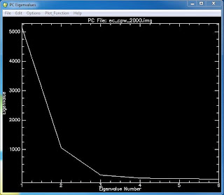
Figure 1: Eigen values for each band (Eigenvalue number) of
the PC image. Higher Eigen values indicate
 more unique information.
ENVI software was used to perform SMA on imagery of Eau Claire and Chippewa Counties, WI. The image was converted into a PC image with 6 bands. Three endmembers, water, agriculture, and forest, were collected from the transformed image feature space plot of bands 1 and 2 of the PC image and one endmember, urban, was collected from bands 3 and 4. These endmembers were then saved as a ROI file and used to create four fractional images through SMA corresponding to each endmember. A classified image was not created with this method but the fractional images and RMS error image were qualitatively analyzed.

 
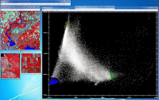
Figure 2: Endmember collection from the transformed image feature space
plot of bands 1 and 2 of the PC image.
 
 
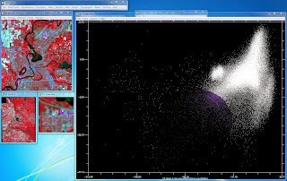
Figure 3: Endmember collection from the transformed image feature space
plot of bands 3 and 4 of the PC image.
 
Figure 4: The fractional images for each of the endmembers
 

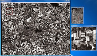
Figure 5: RMS error image

Fuzzy classification was performed with ERDAS IMAGINE software. Appropriate training samples for water, urban, agriculture, bare soil, and forest were collected, merged, and saved. These resulting 5 training samples were then used in a fuzzy classification of the same image of Eau Claire and Chippewa Counties, WI used earlier. The five fuzzy classified images were then hardened using a fuzzy convolution window.

- Results -

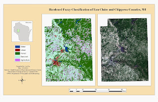
Map 1: The hardened fuzzy classification


- Discussion -

Four fractional images for water, agriculture, bare soil, and urban features were generated through SMA. Each fractional image, aside from urban, makes sense when visually examining the fractional images against a color composite image and Google Earth historical imagery. The fractional image for water highlights water features and areas of higher moisture, like riparian vegetation, and displays urban areas in black or dark tones of gray. Areas of bare soil display a wide range of values from bright white to dark gray. The fractional images for agriculture and bare soil are interesting to compare. Both de-emphasis water and urban features and seem to be opposites of each other in regards to highlighting vegetated and non vegetated land cover. Plots of land that are highlighted in the agriculture fractional image are not in the bare soil fractional image and vice versa. Forested area is highlighted in the agriculture fractional image more so than the other three. For the urban fractional image, all land covers, except for bare soil, are highlighted in white or light tones of gray. Urban features are mostly white which is desirable but too much agriculture, forest, and water are highlighted as well. This could be due to a lower quality endmember taken for urban features when compared to the other endmembers, which can be seen in Figures 2 and 3.

 The RMS error image indicates less error for water and urban features, more error for agriculture and forested areas, and the most error for bare soil. This demonstrates that just because a fractional image for a land cover makes sense in comparison to that specific land cover, this does not mean that there is no error associated with that land cover in comparison to other land covers. In the water fractional image, areas of bare soil are commonly highlighted. This error plus the small amounts of error (dark tones of gray) for bare soil in the fractional images for urban and agriculture can add up. The small amount of error associated with urban features makes sense because in every fractional image, aside from the one for urban, urban features are shown in black or dark tones of gray. The same can be said for water, even though water features are highlighted in the urban fractional image as well as the water fractional image.

Qualitative confidence building was performed on the classified image produced through the fuzzy classification method. Compared to the qualitative assessments of the images produced through unsupervised and supervised classification of the same area, the fuzzy classification method did a much better job at representing actual land use/land cover (LULC) (Map 1). The distribution of urban areas are far more appropriate and the mix-up between what constitutes bare soil was re-worked. For this classification, fallow agriculture, bare soil, and areas of sparse vegetation (e.g. grass fields, scrublands) were all lumped together into the bare soil class. This helped me find appropriate training samples to accurately model the different LULC types. However, this also means that bare soil is overestimated, but this is an inevitable fact given the requirement of five LULC classes. The training samples were modified three times before generating the final image. Modifying the training samples further could no doubt have improved on the accuracy of the fuzzy classification further.

- Conclusion -

Using SMA provides an opportunity to visualize specific land covers as pure and mixed areas, as well as provides an error assessment. The information gained by selecting quality endmembers can be used to classify an image or enhance a classification. The qualitative confidence given to the classified image produced through fuzzy classification is far greater than that of the classified images produced through unsupervised and supervised methods. The ability of fuzzy classification to determine membership grades for LULC classes per pixel allows for the classified image to more accurately represent the landscape by combating the mixed pixel problem.

- Sources -

Earth Resources Observation and Science Center, United States Geological Survey (USGS). Landsat 7 (ETM+) imagery.

Environmental Systems Research Institute (ESRI). Geodatabase (2013) US Census Data. Accessed through UWEC Department of Geography and Anthropology.


Friday, October 31, 2014

Digital Change Detection

- Introduction -

Digital change detection allows for analysis of biophysical, environmental, cultural, and socioeconomical change across the Earth's surface. By examining and measuring change in LULC over time, humans gain a more complete understanding of how Earth systems and processes function and interact. This knowledge can lead to better land planning and management and more effective environmental monitoring. Important considerations for change detection are an appropriate time period, the temporal, spatial, spectral, and radiometric resolution of each image, and the environmental factors present in the imagery. In this lab exercise, qualitative change detection will be performed on Landsat 7 (ETM+) imagery of western Wisconsin from the years 1991 and 2011 and quantitative digital change detection will be performed using National Land Cover Datasets of the Milwaukee metropolitan statistical area from the years 2001 and 2006.

- Methods -

Qualitative change detection was performed using the Write Function Memory Insertion method in ERDAS IMAGINE. The red band from 2011, NIR band from 1991, and a copy of the 1991 NIR band from the Landsat 7 (ETM+) imagery of western Wisconsin were stacked. By setting the red band to the red color gun and the NIR bands to the blue and green color guns, areas that showed change over the time period were displayed in red (Results - Figure 2). Qualitative visual analysis of LULC change could then be accomplished.


National Land Cover Datasets of the Milwaukee metropolitan statistical area from the Multi-Resolution Land Characteristics Consortium (MRLC) were used to quantify change for each LULC class and then map five specific LULC to-from changes. To quantify LULC change, each dataset was opened in ERDAS IMAGINE and the histogram values for each class were copied from their attribute tables into a Microsoft Excel spreadsheet. A series of calculations was then done to convert the histogram pixel values into area (Ha) values making the data more user friendly. The percent change for each LULC class was then calculated and can be seen in Table 1.


Figure 1: The model used to create the to-from LULC changes
To map the specific LULC to-from changes, a model was made in ERDAS IMAGINE to create five images each showing a different to-from LULC change (Figure 1). The model uses the Wilson-Lula algorithm and begins with both the 2001 and 2006 National Land Cover Dataset rasters. These rasters are then connected to 5 Either-If-Or functions that masks all LULC classes except one desired class. A pair of functions containing the desired masked values for each date of imagery are then connected to a temporary raster file which in turn connects to a binary masking function that masks the values that do not overlap between the two LULC classes. The resulting raster file contains the areas that overlapped between the two LULC classes or in other words, the area that changed from on class to another. The five raster files were then opened in ArcMap and symbolized appropriately.

- Results -


Figure 2: The result of the Write
Function Memory Insertion.

Map 1: The combined result of the desired LULC to-from changes
produced through the model.

 - Discussion -

Urban features are easily distinguishable as showing change when examining the image created through the Write Function Memory Insertion method (Figure 2). The area between the city of Eau Claire and Chippewa Falls shows exceptional change compared to the rest of the image. Major road networks show up bright red in the image which is likely due to new paving or re-surfacing. Some agricultural fields and areas of bare soil show change while others do not. This is likely due to spectral differences created by farmers engaging in various stages of crop rotation and ley farming. Water features showed change throughout the image due to the inevitable variability in how water is distributed on the Earth's surface over time. The Write Function Memory Insertion method allows for a quick qualitative assessment of change between two or more dates of imagery however, provides no quantitative information.

The five LULC to-from changes in Map 1 were chosen based on a hypothetical situation in which the Wisconsin DNR wished to know about LULC changes in the Milwaukee MSA. The to-from changes were: agriculture to urban, wetlands to urban, forest to urban, wetland to agriculture, and agriculture to base soil. Milwaukee County experienced the least amount of these changes. This is because Milwaukee County has more urban and less vegetated land cover in relation to its size than the other counties. Because such an over welling majority of land in Milwaukee county is already urban, little change was depicted. However, in the southern third of the county, below the city of Milwaukee, there are significant sections of agriculture to urban and forest to urban. Overall, agriculture to urban is the most prevalent change throughout the study area.

- Conclusion -

For a quick and simple qualitative change detection assessment of multiple dates of imagery, the Write Function Memory Insertion method is a viable option. If quantitative information is desired, the histogram values for classified LULC images can be compared and by using the Wilson-Lula algorithm, specific to-from LULC changes can be analyzed. Image differencing, not included in this lab exercise, can also be used by comparing pixel values between bands of multi-date imagery. Identifying changes in LULC through these techniques is a preliminary step in further understanding the relation between the Earth and its processes, and human activities.

- Sources -

Earth Resources Observation and Science Center, USGS. Landsat 7 (ETM+).

Multi-resolution Land Characteristics Consortium (MRLC). National Land Cover Datasets (2001, 2006).


Thursday, October 30, 2014

Classification Accuracy Assessment

- Introduction -

In the previous two lab exercises, unsupervised and supervised classification were performed on the same Landsat 7 (ETM+) image of Eau Claire and Chippewa Counties captured on June 9, 2000. Qualitative confidence-building was performed on the classified LULC images and discussed in pervious blog posts. Now, statistical confidence-building will be performed on each classified LULC image through use of an error matrix. The error matrix will provide an overall accuracy, producer's accuracy and user's accuracy. Kappa statistics will also be used.

To generate an error matrix, ground reference points need to be collected. These points can be collected prior to image classification through GPS point collection or surveying, or generated after image classification by using high resolution imagery or aerial photography as a reference. The pixels corresponding to each ground reference point will be labeled with the appropriate LULC class and this value will then be compared to what the pixel was classified. This comparison is then summarized in an error matrix.

- Methods -

Figure 1: Example of how the ground reference
points were interpreted.
Accuracy assessment was performed using ERDAS IMAGINE by navigating to Raster > Supervised > Accuracy Assessment. The Landsat 7 (ETM+) imagery was opened in the Accuracy Assessment window and a high resolution aerial photograph from the National Agriculture Imagery Program (NAIP) of the United States Department of Agriculture was selected as the reference image. Ground reference points were added by navigating to Edit > Create/Add Random Points. The number of points was changed to 125 and stratified random was chosen as the distribution type to allow for an even distribution of ground reference points throughout the different LULC classes.

After the ground reference points were generated, they appeared in the Accuracy Assessment window. Each point was examined and labeled with the appropriate LULC class based on visual interpretation of the reference image. Once all the ground reference points were interpreted, accuracy assessment was performed by navigating to Report > Accuracy Assessment. Values from the resulting text file were copied into a Microsoft Excel spreadsheet for easier to understand formatting.

- Results -


- Discussion -

In terms of overall accuracy, the statistical confidence-building assessment confirms the conclusions of the qualitative confidence-building assessments. The unsupervised method produced a better classified LULC image because of the quality of urban/built-up training samples collected during the supervised method. As seen in Table 2, The user's accuracy for urban/built-up is only 11%. Of the 36 ground reference points that were placed within the urban/built-up class, only 4 were interpreted as urban/built-up. Forest, bare soil, and agriculture were often confused for urban/built-up by the supervised classifier. The user's accuracy for each LULC class, except for urban/built-up, is higher for the supervised method. By modifying the training samples used for the supervised classification, the user's accuracy for urban/built-up, agriculture, and bare soil could be further increased, along with its overall accuracy.

A threshold of 85% has been established as the minimum overall accuracy needed for a "good" classified image. The overall accuracy for both classified LULC images fell below this threshold indicating that neither should be used for further analysis. A revised supervised classification could potentially reach the 85% threshold or an advanced classifier could be used.

- Conclusion -

In this lab exercise, the accuracy of the classified LULC images was assessed using four different measures of accuracy (overall, producer's, user's, and kappa) obtained from interpreting error matrices. Each method used, unsupervised and supervised, has its advantages and disadvantages though neither was able to reach an appropriate level of accuracy to be used in further analysis.  Advanced classifiers like expert system/decision tree, neural networks, and object-based classifiers were developed for just this reason. In subsequent lab exercises and blog posts, these advanced classifiers will be examined.

- Sources -

Earth Resources Observation and Science Center, United States Geological Survey. Landsat 7 (ETM+).

United States Department of Agriculture (USDA) National Agriculture Imagery Program. High resolution aerial imagery.


Friday, October 24, 2014

Pixel-Based Supervised Classification

- Introduction and Background -

To perform supervised classification, an analyst will collect samples areas of known land cover, commonly referred to as training samples, from the image which will be used to train a classifier. The classifier will then classify the entire image based on the information gathered from the collected training samples. Preferably, training samples would be collected based on prior knowledge of the area using the most accurate means available (GPS, topographic survey, etc.) However, for some applications this is impractical and high resolution imagery can be used to designate areas for training samples.

Important factors to consider when collecting training samples include: the number of training samples, the number of pixels, shape, location, and uniformity. In general, a minimum number of 50 training samples per informational class is required to produce an accurate classified LULC image. The specific number of training samples for individual informational classes may vary depending on the nature of the image (spectral diversity) and project (special emphasis or resource availability). Another factor that may fluctuate is the number of pixels. Generally, 10n pixels, where n is equal to the number of bands in the image, is required to provide enough spectral information for the training sample's informational class to be properly identified. The shape of training samples will normally be a derivation of a polygon. Training samples should be distributed throughout the entire image to account for spectral variability in the informational classes and be located within a uniform and homogeneous land cover. An important concept to keep in mind is the geographic signature extension problem where differences in spectral characteristics of the same informational class result form differences from a variety of factors like, soil moisture and type, water turbidity, and crop species. To reduce the errors that result from the geographic signature extension problem, training samples should cover all possible variations of the desired informational classes (e.g. for vegetation, collect forest and riparian vegetation).

Training samples need to be evaluated before they are used to train a classifier. The histograms of a training sample should not be primarily multimodal. Training samples with more Gaussian histograms will produce a more accurate classified LULC image. If a training sample exhibits mostly multimodal histograms it should be deleted and collected again. Spectral separability will indicate the best bands to use for an analysis based on the separation of the bands of the spectral signatures of the training samples. The larger the separation between spectral signatures for a particular band, the better that band will be for classifying different land covers. Spectral separablilty can be calculated using software like ERDAS IMAGINE and produces a list of the best bands and an average score. The maximum value of the average score is 2000 indicating excellent separation between classes. Values above 1900 indicate good separation and values below 1700 indicate poor separation. If the average score of the training samples is below 1700, an analyst should examine the training sample's spectral profiles and histograms to look for abnormalities and possibly collect more training samples. If the average score is satisfactory, the training sample can be used to train the classifying algorithm (classifier).

Advantages of supervised classification over unsupervised is the control the analyst has over informational classes produced and not having to interpret the spectral clusters generated by unsupervised methods. Also, by analyzing the quality of training samples, the classification can be improved before its actually performed. However, collection of proper training data can be time-consuming, expensive, and may not fully represent the desired informational classes leading to errors in classification.

Pixel-based supervised classification using a maximum likelihood classifier will be performed on the same Landsat 7 ETM+ image of Eau Claire and Chippewa Counties used in the pervious lab exercise where the unsupervised ISODATA method was performed. For this introduction to supervised classification, the size of training samples must be at least 10 pixels, the number of training samples for each informational class will be 15, and the training samples will be polygons collecting from the entire image taking the geographical signature extension problem and uniformity into consideration. The reference for determining training samples will be Google Earth historical imagery near the image collection date of June 9, 2000.

- Methods -

Figure 1: Example of how training samples were collected
and recorded.
The Landsat 7 ETM+ imagery was opened in a viewer in ERDAS IMAGINE 2013 and Google Earth was synced to the viewer. To collect training samples, polygons were drawn on the Landsat imagery that corresponded to homogeneous areas of land cover interpreted from the Google Earth historical imagery. Polygons were drawn by navigating to Home > Drawing > Polygon (in the insert geometry section of the drawing toolbar). Once the polygon had been drawn, its spectral characteristics were recorded by navigating to Raster > Supervised > Signature Editor > and with the polygon selected the Create new signature(s) from AOI icon was selected. After the new signature was added, the name and color was changed to match the appropriate interpreted LULC class (figure 1). After 15 training samples had been collected for an informational class, their spectral profiles were examined. If a spectral profile was noticeably different from the rest, its histograms were analyzed for multimodal histograms. If the training sample had more than 4 multimodal histograms, it was deleted and re-collected.


Figure 2: The optimum bands for analysis are circled in red.
The best average separability is circled in blue.
Training samples were collected for 5 LULC informational classes: water, forest, agriculture, urban/built-up, and bare soil. Once all 75 training samples had been collected and assessed, their spectral separability was analyzed by navigating to Evaluate > Separability in the signature editor window. The layers per combination was changed to 4 and the Transformed Divergence radio button was checked for the distance measurement. The value for best average separability was 1974 which was acceptable and the training samples were kept (figure 2). The 15 training samples of each informational class were merged into one signature. Once all 5 informational class signatures were created, the 75 training sample signatures were deleted. The 5 summarized signatures left were then saved and used to train the maximum likelihood classifier (figure 3). The image was classified by navigating to Raster > Supervised > Supervised Classification. The input and output files were specified, the 5 informational class signature file was selected as the classified file, the non-parametric rule was set to none, and the parametric rule was set to maximum likelihood.
Figure 3: The final 5 informational class signatures that were used
to train the classifier.

- Results -

Map 1: The classified LULC map created through pixel-based
supervised classification using a maximum likelihood classifier.

- Discussion -

Just like the last lab exercise where unsupervised classification was performed with the ISODATA method, qualitative confidence-building assessment was performed on the LULC map generated through pixel-based supervised classification. When compared to the classified LULC map generated through the unsupervised method, the supervised method resulted in a worse classification. The supervised classification method greatly overestimated urban/built-up land, erroneously classifying urban/built-up in areas of bare soil and sparse vegetation. The error in the classification was most likely due to the low number of training samples taken for each informational class and the quality of training samples derived from urban features. As stated in the introduction, a minimum of 50 training samples should be collected for every informational class. For this lab however, only 15 training samples were collected for each informational class. Almost every training sample collected for urban features displayed multimodal histograms no matter how many times these training samples were re-collected. No confidence is given to this map and the training samples would need to be modified if the classified LULC map was to be used for any subsequent analysis. Because urban/built-up is so grossly overestimated, determining the accuracy of the other informational classes is difficult by visual analysis. Once more and better urban/built-up training samples and possibly more agriculture and bare soil training samples were collected, the accuracy of forest and water could be better determined.

- Conclusion -

The supervised classification method did not produce a better classified LULC map compared to the output of the unsupervised ISODATA method like I had hoped. This was because of the low number of training samples taken for informational classes and the poor quality of urban/built-up training samples overall. Even though the supervised method resulted in a poorer LULC map, the results can be tweaked by modifying the current training samples and adding more training samples for informational classes that caused extensive errors. With a proper number of quality training samples, the pixel-base supervised classification method could produce a better quality LULC map. Statistical confidence-building assessments will be performed on both classified LULC maps generated through the unsupervised and supervised methods in the next lab exercise to quantify the difference in accuracy of the two methods.

- Sources -

Earth Resources Observation and Science Center, United States Geological Survey. (2000) Landsat ETM+


Tuesday, October 14, 2014

Unsupervised Classification - ISODATA

- Introduction -

Image 1: Screenshot of the ETM+ image subset of
Eau Claire and Chippewa counties in False Color IR
Extracting land use/land cover (LULC) information from remotely sensed imagery can be performed through multiple methods including: parametric and nonparametric statistics, supervised or unsupervised classification logic, hard or soft set classification logic, per-pixel or object-oriented classification logic, or a hybrid of the aforementioned methods. Unsupervised classification, using the Iterative Self-Organizing Data Analysis Technique (ISODATA) clustering algorithm, will be performed on a Landsat 7 ETM+ image of Eau Claire and Chippewa counties in Wisconsin captured on June 9, 2000 (Image 1). Minimal user input is required to preform unsupervised classification but extensive user interpretation is needed to convert the generated spectral clusters into meaningful informational classes. The conceptual framework of the ISODATA algorithm, along with its available user inputs, and LULC class interpretation will be discussed in this lab exercise.

- Background -

ISODATA is a modification of the k-means clustering algorithm in that it has rules for merging clusters, based on a user defined threshold, and splitting single clusters into two.
ISODATA is considered self-organizing because it requires little user input. The required input includes: a maximum number of clusters to be generated, a maximum number of iterations, a convergence threshold (to determine a percentage of pixel values that will remain unchanged between iterations), a maximum standard deviation (to determine cluster splitting), a minimum percentage of clusters (to determine cluster deletion and reassignment), a split separation value (used in cluster splitting), and a minimum distance between cluster means (to determine cluster merging). The algorithm begins by placing arbitrary cluster means evenly throughout a 2D parallelepiped based on the mean and standard deviation of each band used in the analysis. These cluster means are recalculated and shifted in feature space based on a minimum distance from mean classification rule through each iteration. Once the user defined convergence threshold has been reached, iterations cease and the resulting spectral clusters can then be interpreted.

Advantages of unsupervised classification is no extensive knowledge of the study area is required. Little user input is needed to perform unsupervised classification which minimizes the likelihood of human error. However, the analyst has little control of the classes generated and often these clusters contain multiple land covers making interpretation difficult.

- Methods -

ISODATA was performed in ERDAS IMAGINE 2013, by navigating to Raster > Unsupervised > Unsupervised Classification. In the Unsupervised Classification window, the input raster and output cluster layer were assigned, and the Isodata radio button was selected to activate the user input options. ISODATA was performed twice on the image. Once with a class range of 10 to 10 and again with a class range of 20 to 20. The max iterations was changed to 250 and all other inputs were kept at the default values, with the exception of a 0.92 convergence threshold for the ISODATA with 20 classes. Also, the Approximate True Color radio button was selected in the Color Scheme Options. A value of 250 was chosen for the max iterations to ensure the algorithm would run enough times to reach the convergence threshold, however, both ISODATA algorithms only had to cycle through seven iterations before this was accomplished.


Image 2: Comparison of the original image (left) and the
ISODATA classified image before recoding (right)
The resulting classified image (Image 2) was opened in a viewer and the generated clusters were recoded into thematic information classes by navigating to Table > Show Attributes. With the image attributes open, each cluster was selected one by one and its color was changed to gold making it easy to distinguish compared to the other approximate true colors generated by the algorithm. The classified image was synced with Google Earth historical images to determine which land cover is most associated with each cluster. Once a decision was made the color was changed to either green for forest, blue for water, red for urban/built up, pink for agriculture or sienna for bare soil and given the appropriate name (Image 3). The columns in the attribute window can be modified to allow for easier interpretation by navigating to File > View > View Raster Attributes > and selecting the Column Properties icon.  After all the clusters had been recoded, the attribute window was closed and in the pop-up window, Yes was selected to save the changes. The recoded image was saved by navigating to File > Save As > Top Layer As.


Image 3: Screenshot of the process of determining LULC classes from the ISODATA generated
clusters. Google Earth historical imagery on one monitor was synced to the ERDAS viewer on another monitor.

In order to make a map of the LULC classified image, the image classes needed to be recoded from 10/20 classes down to the 5 desired classes. This was done by navigating to Thematic > Recode. In the Recode window, the New Value field was modified for each record depending on the class name defined by the user earlier in the attribute window. Water was given a value of 1, forest - 2, agriculture - 3, urban/built up - 4, and bare soil - 5. The new values were then saved by selecting Apply in the Recode window and the image was saved by navigating to File > Save As > Top Layer As. Now, when the attribute window was opened, only 5 classes appear, rather than 10 or 20, representing the entire image. The images were then opened in ArcMap 10.2.2, symbolized appropriately, and represented as a map comparing the two ISODATA recoded images.

- Results -
Map 1: Comparison of the two ISODATA classifications

- Discussion -

Qualitative confidence-building assessment was performed by visual comparison between the classified LULC image and Google Earth historical imagery. Statistical confidence-building assessment will be performed in a subsequent lab. The ISODATA classification which generated 20 clusters (ISO[20]) was more accurate than the 10 cluster ISODATA (ISO[10]). Urban/built-up area is greatly overestimated in ISO[10] which is corrected in ISO[20]. However, agriculture is overestimated more in ISO[20]. The differences between urban/built-up, agriculture, and bare soil is caused by the spectral similarities of the features. Agricultural land ranged from healthy crops to fallow fields. Healthy crops had spectral similarities to forest while fallow fields had spectral similarities to bare soil. When determining informational classes from the ISODATA generated clusters, fallow fields were considered agriculture instead of bare soil. This distinction likely caused agriculture to be overestimated in ISO[20]. Some regions of water, mostly smaller rivers, were incorrectly classified agriculture or forest. This is most likely caused by vegetation overlap masking the reflectance of the water.


- Conclusion -

Overall, interpretation was difficult because there was extensive overlap between the 5 desired informational classes and the 10/20 generated clusters. Classes with overlap included: forest and healthy agriculture, bare soil and urban area, and fallow fields/sparse vegetation and bare soil. ISO[20] was more accurate because more clusters were generated which allowed for more specific spectral characteristics to be singled out and classified accordingly. Although ISO[20] was more accurate, it still overestimated agriculture lands and had erroneous classifications for urban/built-up and forested land. To increase the accuracy of the LULC map generated, supervised classification could be used and will be used in the next lab.


- Sources -

Earth Resources Observation and Science Center, United States Geological Survey. (2000) Landsat ETM+